Guest Expert: Aggie Villanueva
Book marketing at twitter involves many facets besides creating tweets that draw a crowd to your product. Many times we give no attention to our profile page and that is a mistake. That’s the first thing everyone sees. We must make sure our profile inspires confidence to purchase from us. A professional looking background is vital.
As tweeters we always feel more trust in a retailer (and we writers are our own book retailers) when their twitter profiles have professional looking backgrounds. It doesn’t have to be showy or complicated. But a custom background shows competence and diligence to branding and reputation. Your brand needs to carry your “look” through all your sites, including social, and compliment your reputation as a whole by assuring that you supply professional services/ expertise/products.
Automated Background Generators
There are quickie workarounds to custom backgrounds. Free Twitter Designer automates some of the process. You just have to upload the image(s) you desire as a background and tweak them.
You will need a little knowledge of images to properly prepare your logo, photo(s), etc. in the right size. Make sure they are less than two megabytes and in one of the following formats: .jpg, .png, .gif.
You can select the image once you’ve added it and rotate it, and adjust the width and height. This will, of course, distort it completely, so usually won’t help. You’ll need to go back to your photo editing software and create the image in the proper size and then re-upload. It will take some adjusting and readjusting to get it to fit right.
You can also change the blend mode which can create some attractive blends with your background colors. And their filters; stroke, shadow, blur, bevel and glow will helps set your look apart from the crowd.
Or You Can Always DIY

Automation always takes away some control over the finished product. With some effort you can create a background from scratch. If you’ve worked a little with images then your own design, complete with logo, is completely doable.
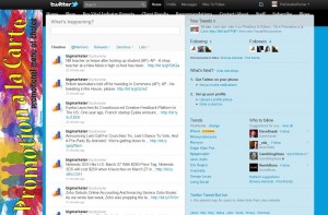
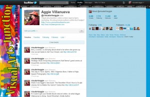
I did it. (See images above and below.) My twitterbackground is not perfect and just wasn’t for me, so I created twitter backgrounds for Visual Arts Junction and Promotion a la Carte. I’m definitely not a professional web designer, and my design appears differently in different sized devices. Luckily when the New twitter came along it didn’t require any redesigning. People notice the design carries my brand and shows I care about my face presented to the world, including the social media world.

Background Body
For the body of my twitter background I created a blank image in Photoshop and picked up a predominant color from my homepage then “filled” the main body of my background with this color.
The twitter “profile stuff” will cover most of this area, especially on smaller screens. You don’t want to waste your main background image(s), such as a logo or photo, in this center body where they will be covered up anyway. That’s why I chose to leave it blank and filled with my predominant site color. The body of your back ground image can be approximately 1255 pixels wide by 555 pixels high.
Background Top
For my background images I took a screen shot of the sites’ home page and then divided into sections. For the top of the twitter background I cropped out the black “Page Menu” across my homepage screenshot and set it right on top. It fit perfectly in the blank space above where the twitter “profile stuff” begins.
Left Sidebar
There is a blank area on the left of your profile background that is perfect for your images, such as your headshot, book cover(s) logo, etc.. From my screen shots of home pages I cropped out the top masthead (which is my logo) and rotated it 90 degrees to use as the left sidebar. Make your left sidebar approximately 245 pixels wide.
Right Sidebar
You will still have approximately 250 pixels width on the right side of the twitter “profile stuff.” I left this blank, only filled with the predominant site color. But you can use it any way you choose, such as images of text further explaining your purpose. But be sure to leave the top half blank where twitter places its own info about your profile.
Place Your Background
Once you are satisfied with your background, go to your profile’s Settings/Design to upload your finished image in .jpg, or .png formats. These pixel specs I’ve listed are very general and even when following them you may find something doesn’t fit quite right. I had to tweak my Photoshop image several times and re-upload till I got it right.
It’s really not as hard as you’d think to create a custom twitter background, and the resulting customer trust is well worth the effort. When you get yours finished be sure and come back with a link for me to go check it out. That’s one of my favorite pastimes.
Additional Resource
An excerpt from Twitter Tips for More Effective Tweeting, by Phyllis Zimbler Miller.
• Twitter sidebar color needs to be light
At the risk of repeating myself once again for people who know better – do NOT use a dark color on the sidebar of your Twitter profile. Using a dark color almost always means that your Twitter bio is unreadable.
• Twitter bio needs to be there
And have a bio. This is especially important if you want people to be encouraged to follow you. Why would someone follow a person who doesn’t even bother to include a 160-character-maximum bio?
• Do NOT link from your Twitter profile to a blog with long paragraphs in reverse type (white on a dark background)
Most people find these posts so difficult to read that they don’t bother. If you want people to read your posts, use dark type on a light background and SHORT paragraphs with a line of white space between each paragraph to help the eye “rest.”
See the rest of Phyllis’ helpful resource.
 A published novelist before she was 30, bestselling author Aggie Villanueva published Chase the Wind, and Rightfully Mine, both at Thomas Nelson 1980s. Her two self-published books Rightfully Mine and The Rewritten Word each became bestsellers in three Amazon print & Kindle categories within months of publication, The Rewritten Word within weeks. She founded Visual Arts Junction blog Feb. 2009. By the end of the year it was voted #5 at Predators & Editors in the category “Writers’ Resource, Information & News Source” for 2009. Aggie is founder of Promotion á la Carte, author promotional services. Villanueva is also a critically acclaimed photographic artist represented by galleries nationwide, including Xanadu Gallery in Scottsdale, AZ. Contact Villanueva at aggie@promotionalacarte.com.
.


