Expert: Claudia Jackson
 Ahh, yes — there is nothing quite like sitting down and reading a good book. Part of the experience is not just the story, but in the presentation itself. In days past, we enjoyed holding the book and the feel of the paper as we “fell” into the story without distraction. Now, we sit back with our eReaders and focus on the story. But wait?!? Has the book’s formatting made our “eyes cross,” left us in confusion, distracted us from the story at a critical moment?
Unfortunately, a bad side effect of the eBook’s quickly changing technology is that the reader’s experience is also changing – sometimes not for the good. More importantly, failure to deliver a quality eBook format is now adversely affecting the author’s reviews! The experience disrupted by the fact that we now sometimes are befuddled by where paragraphs end and begin, sometimes having to look over the fact that there is a page number or book title in the middle of a sentence can, and will, change how we feel about the book. The reader has lost patience with reading the book and now finds fault with the story and gives it a bad review. When in reality the reader was unhappy because where there was supposed to be an “escape into the story.” The sloppily formatted eBook has removed that from the reading experience.
How do we prevent this potential disaster? The answer: Your book needs to be properly formatted with an amazing level of dedication to proper formatting in the most generic presentation possible and be available in as many media types to have it viewed by the broadest audience.
One of the first steps in self-publishing is getting your manuscript ready for upload to the publishing channels that you have selected — hopefully all of them!!! To get the maximum exposure for your book, you need it to be available in perfect form (or as close as you can get to it) in all of the eBook platforms including the Kindle, the Nook, the Sony eBook reader and the iPad. Sounds easy? After all, it’s just text and the upload must be simple. Sorry, there are no standards, there are no common word processing file types, eBooks are page-less and paper books are page-defined. To make matters worse there is no one standard for eBooks and it may not get easier anytime soon as various hardware companies all want their own version of an eReader. For example some of the various formats are:
▪ ePub
▪ Sony Reader (LRF)*
▪ Barnes & Noble Nook
▪ Apple iPad*
▪ Kindle (.mobi)
▪ Palm Doc (PDB)
▪ PDF (Adobe)
▪ Rich Text Format (RFT)
▪ Plain Text (TXT)
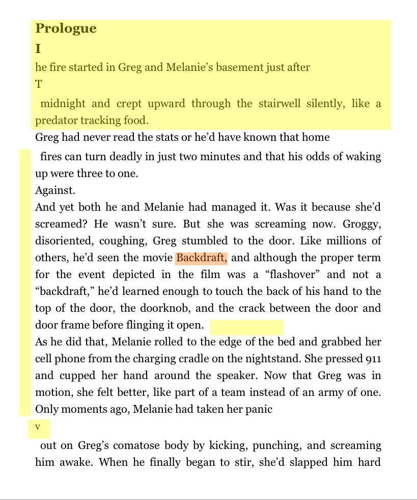
Below is an example of what an eBook looks like when it is not formatted correctly. Many publishers, even those that advertise that they are specialists in the self-publishing world, just upload the PDF file that they used to have the book printed. The problem is not just limited to little-known authors. Many of the eBooks released today that were written by author super stars suffer these same indignities. Note some of the problems highlighted below:
▪ No paragraph breaks or indents
▪ Page number ends up in the middle of the page
▪ The “center” feature is lost.
▪ “Italics” is lost (red highlight).
This is not how the author intended to present his book, but this is the impression of the reader. In general, unless the user is reading with a PDF reader, PDF files do NOT make good eBook files.

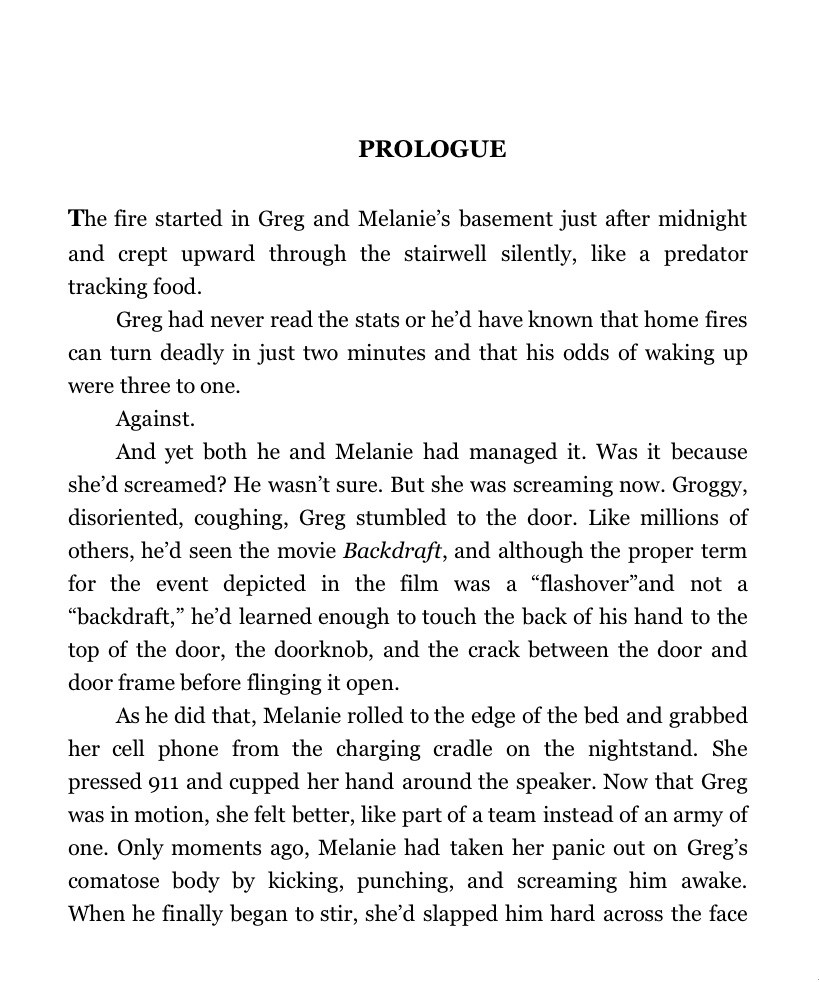
Same Page – Formatted Correctly (See Below)
This book has been reformatted according to the recommendations of one of the eBook distributors. Notice the difference. The page is clean and the reader can focus on the story and not be distracted by the formatting.

Bad formatting, especially in an eBook where page endings and special formatting does not exist (again as I write this, the rules are changing faster than I can type this article — the EPUB format, for example) dramatically affects the experience for the reader. Again, unfortunately, this can reflect badly upon the author. We see reviews that even comment on this – not to the author’s credit. The reader becomes so distracted by the formatting that the story is forgotten, no matter how well written.
How close did you look at the “good example?” Yep, there is an error — they are easy to miss.
So, when you are about to format your eBook, please read the style guides of the eBook distributor, stay within the rules and boundaries, and most importantly, KISS (keep it simple sweetie)! Your eBook will love you for your extra effort and attention to detail. More importantly, your readers will love you for it!
A very special thanks goes to John Locke (Twitter: @DonovanCreed), author of “Lethal People,” “Lethal Experiment,” “Saving Rachel,” “Now & Then,” “Wish List,” and “Follow the Stone” for allowing me to use the above samples.
Photo Credit: Mike Licht, NoltionsCapital.com
 With over 20 years of experience as a corporate computer trainer and consultant, Claudia now works with a Digital Private Press – Telemachus Press who have launched NovelHelp University this year as an inexpensive solution. This site offers all of what the do-it-yourselfer needs to know, including hands-on training and step-by-step guides. Follow Claudia – Twitter | Blog


